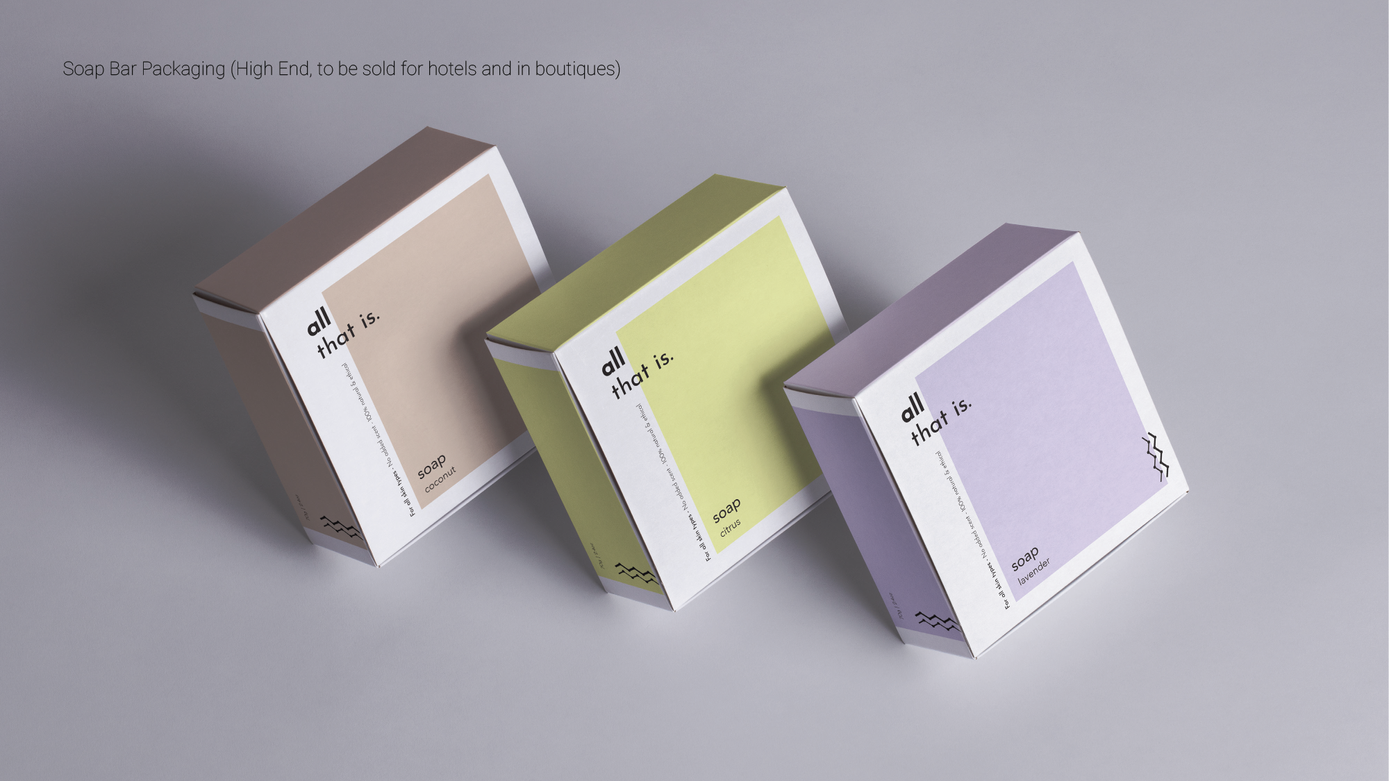
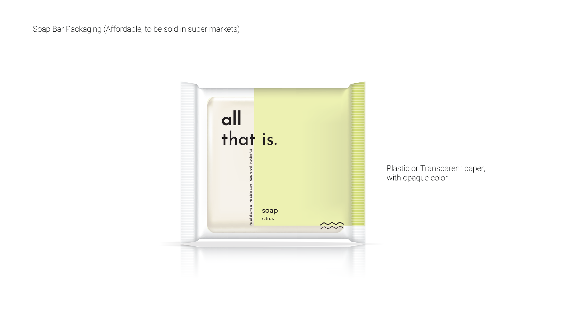
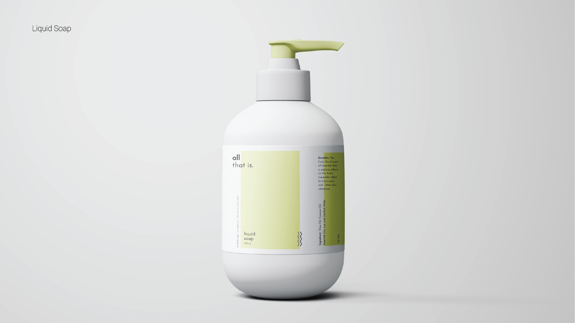
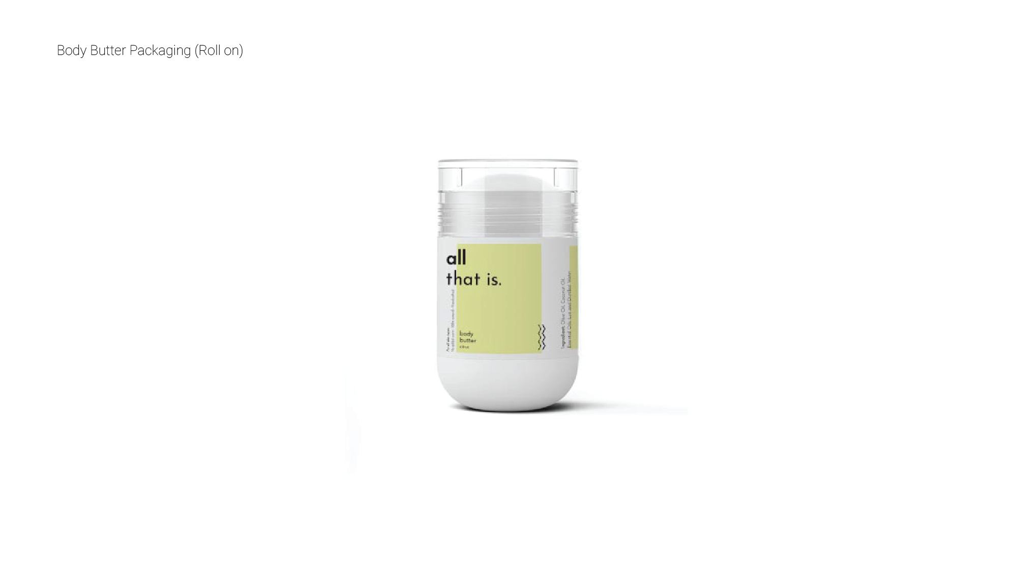
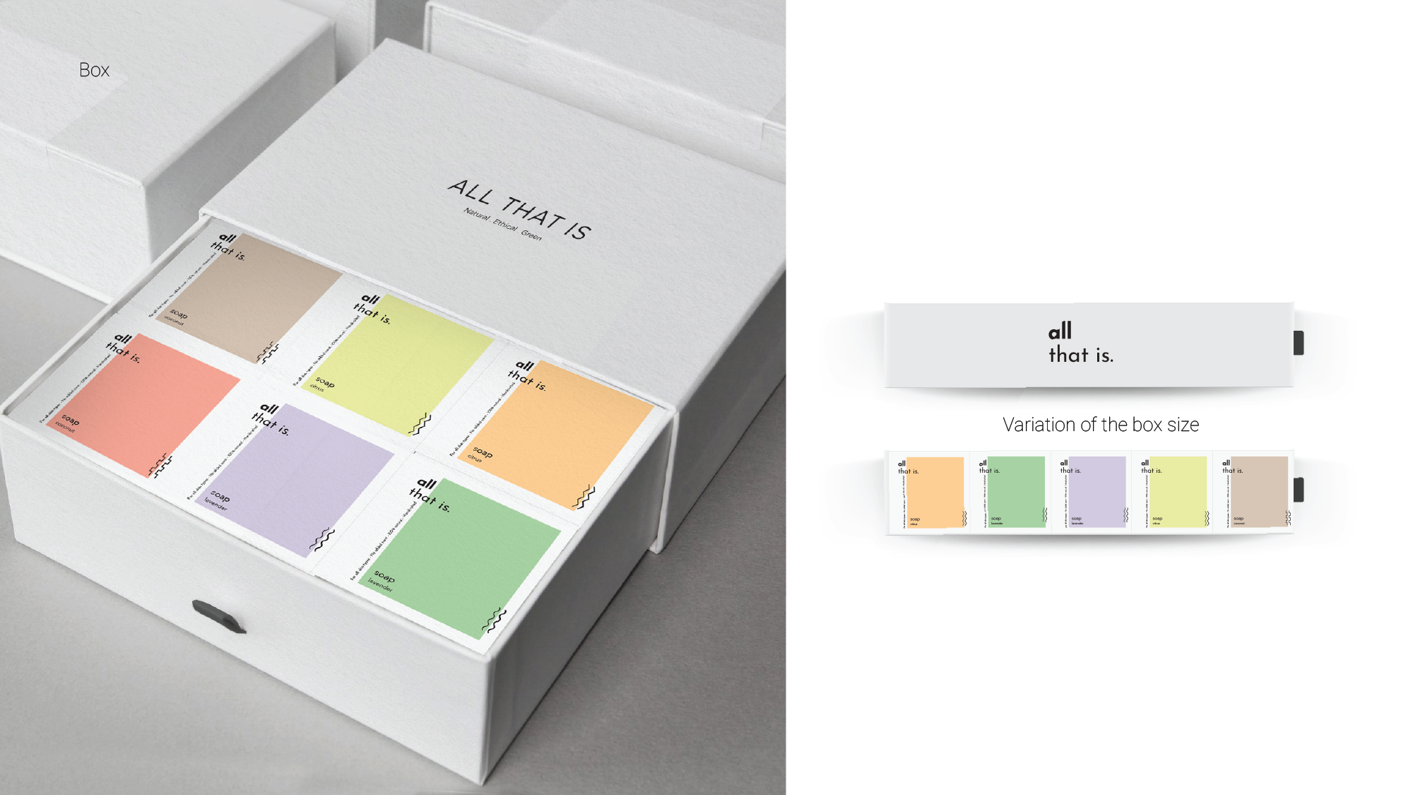
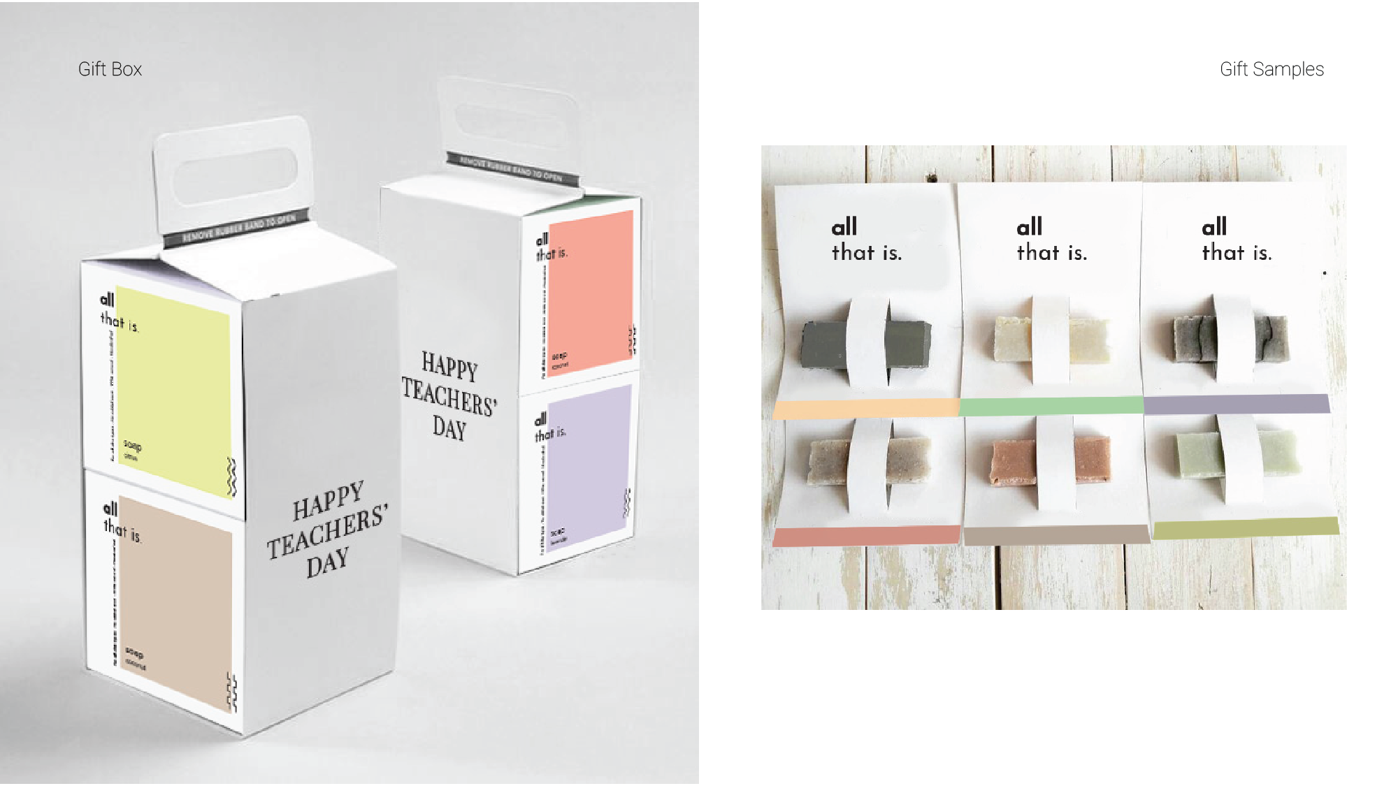
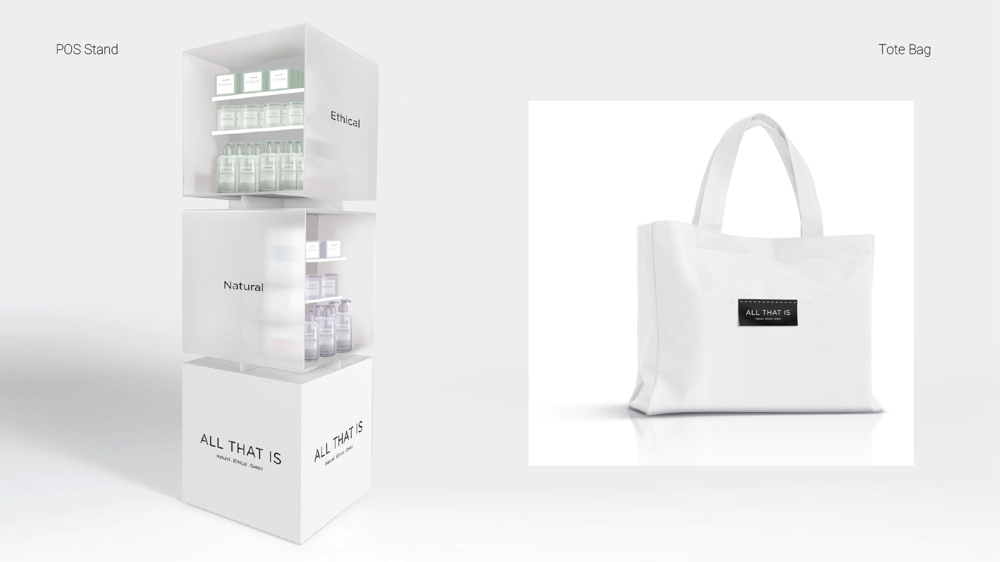
All That Is offers clean and beauty products.
Their range of products are all natural with no additives or fragrances. The soaps and derivative products are the modern version of what you would find at grandma’s house,
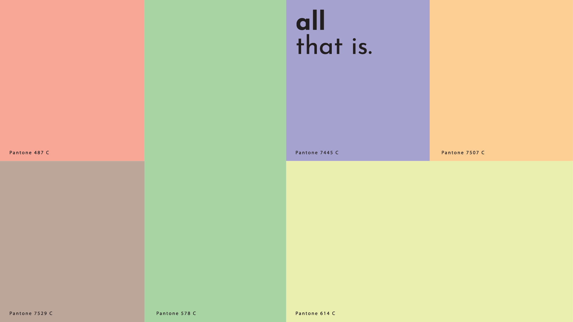
The brief was to create an identity that reflects a premium artisanal look & feel that takes us back to nature, through truth and simplicity.
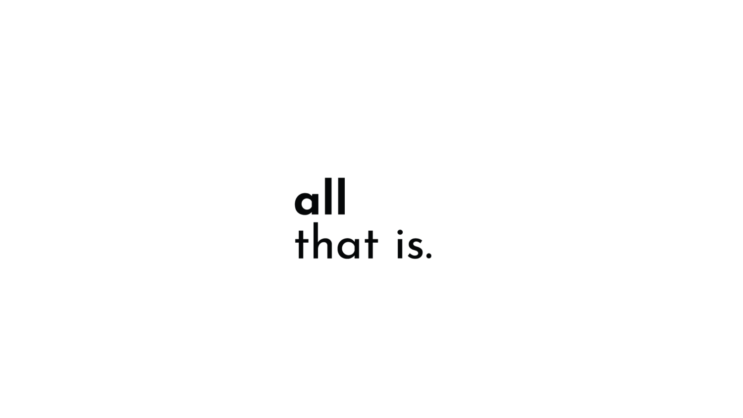
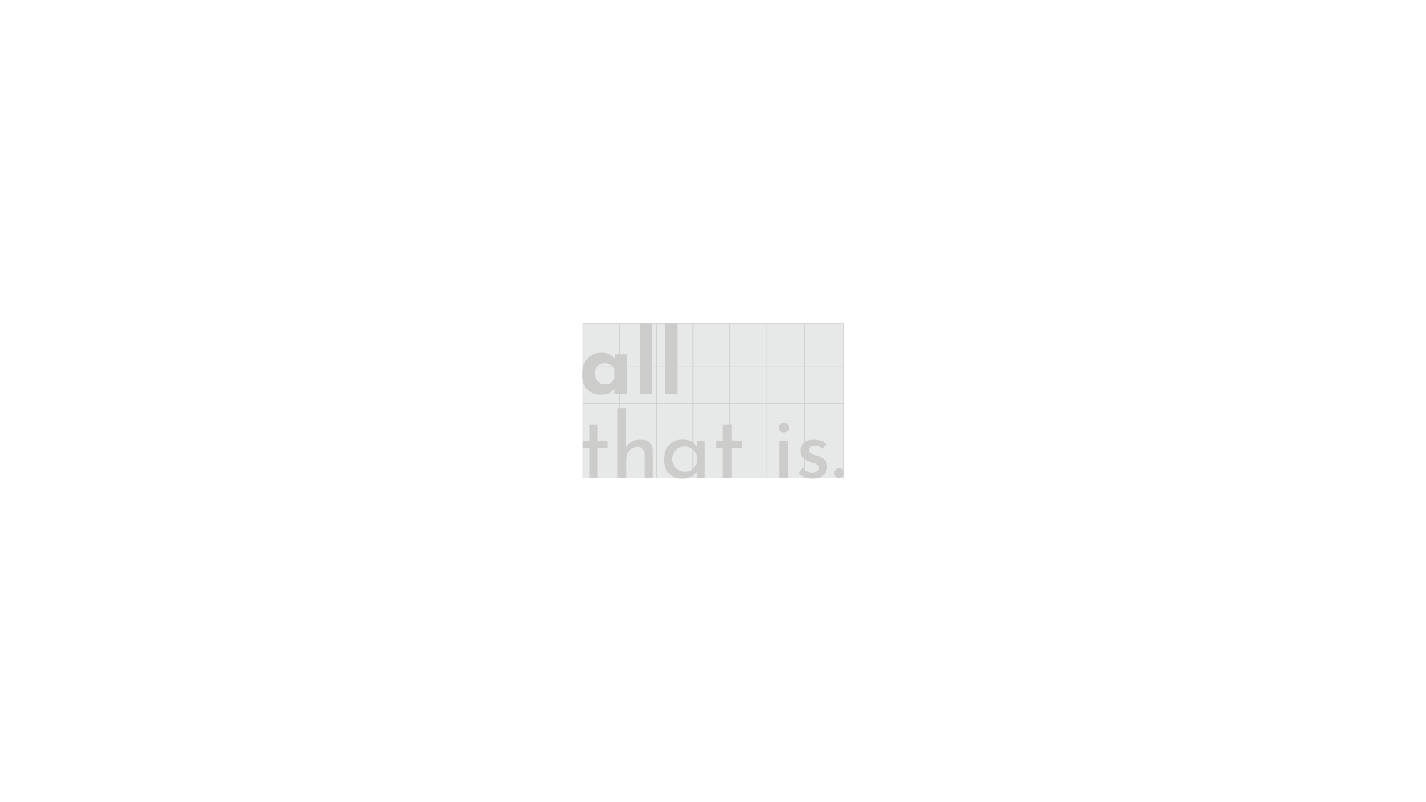
This was an option presented to the client: A minimalistic approach that is type based. The logo ends with a period because this is ALL THAT IS, nothing else is required. Its simplicity is punctuated by the confidence of the period at the end.
This project was done during my work experience at Spearhead Agency.
